A well-designed flyer can fill an event, promote a business, or spread a message, but most people do not have the time, budget, or software skills to design one from scratch. The gap between needing a flyer and actually having one used to require hiring a designer or spending hours wrestling with complex software. Today, template-based flyer design tools have closed that gap almost entirely, giving anyone the ability to produce a polished, print-ready or shareable flyer in minutes. This guide covers how to find and use the best flyer design resources, and the practical techniques that separate a forgettable flyer from one that gets results.
Why Templates Are the Smartest Starting Point for Flyer Design
Starting a flyer from a blank canvas is an intimidating and inefficient approach for anyone who is not a trained graphic designer. Blank canvas design requires decisions about layout grids, typographic hierarchy, color theory, and visual balance, all before a single word of content is placed. Templates eliminate these foundational decisions by providing a professionally considered structure that can be adapted to any content, industry, or purpose in a fraction of the time.
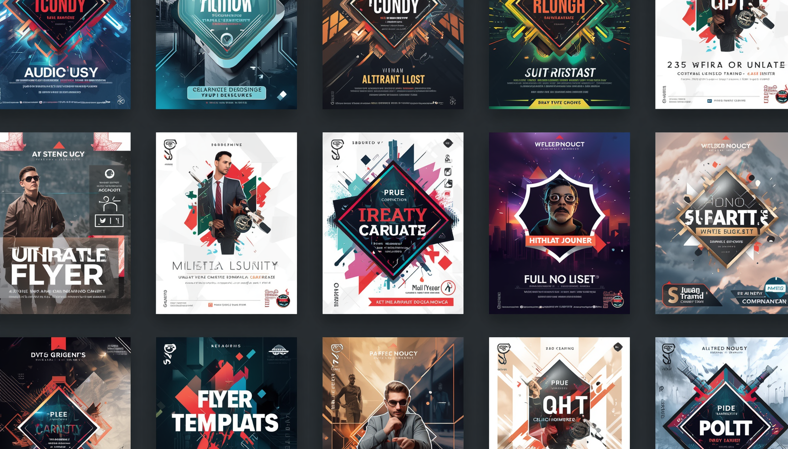
The best flyer templates are not just placeholders with generic stock imagery and default fonts. They are purpose-built layouts designed around specific use cases: concert announcements, restaurant promotions, real estate listings, fitness class schedules, nonprofit fundraisers, school events, and dozens of other contexts. When you start from a template built for your specific use case, the visual logic of the layout is already working in your favor. The hierarchy of information, the balance of text and imagery, and the overall tone of the design are all calibrated for the type of message you need to communicate.
Template libraries with thousands of options also give you the creative freedom to explore different approaches quickly. Instead of committing hours to a single design direction, you can browse multiple template styles in minutes and choose the one that feels right before investing time in customization. This kind of rapid iteration is only possible at scale, which is why the size and quality of a platform’s template library is one of the most important factors in evaluating a flyer design resource.
What to Look for in a Flyer Design Resource
The market for online flyer design tools has expanded considerably, and not every platform that promises easy, fast design delivers on both counts. When evaluating a resource for flyer creation, the key factors to assess are template volume and relevance, customization depth, asset integration, and output quality.
Template volume matters, but relevance matters more. A library of ten thousand templates is only useful if a meaningful portion of those templates apply to the type of flyer you are creating. Look for platforms that organize their template libraries by industry, occasion, style, and format so that finding the right starting point takes seconds rather than minutes. Filtering tools that let you narrow by color scheme, layout style, or content type are a significant usability advantage over platforms that require you to scroll through large undifferentiated libraries.
Customization depth determines how far you can take a template from its default state without hitting the limits of the tool. A platform that lets you swap colors, replace images, change fonts, and reposition elements gives you the flexibility to make a template feel like your own design rather than a filled-in form. Access to a built-in asset library, including stock photography, icons, and graphic elements, within the same environment means you do not need to source images separately and import them manually. The more of the production workflow that happens inside a single tool, the faster and more consistent the output will be.
10 Tips for Designing Flyers That Work Fast and Look Professional
1. Choose a Template Built for Your Specific Purpose
The single fastest path to a finished flyer is selecting a template that was designed for your exact use case. A template built for a music event already has the visual weight and layout logic appropriate for that context: a dominant headline zone, space for date, time, and venue information, and an atmospheric visual treatment. Using that template for a fitness class flyer is possible but requires more customization than starting from a fitness-specific template would. When a platform offers thousands of templates organized by category, invest the two minutes it takes to narrow your search to the most relevant category before selecting a starting point.
Purpose-specific templates also tend to handle the information hierarchy of their use case correctly by default. An event flyer template knows that the event name is the dominant element, the date and time are secondary, and the ticketing or contact information is tertiary. A real estate flyer template leads with the property visual and the price point. Starting from a template that matches your content type means the structural decisions are largely made for you, which accelerates customization and reduces the risk of producing a layout where the most important information does not register first.
2. Lock Your Brand Elements Before Customizing Content
If you are creating a flyer for a business, organization, or personal brand, the first customization step should always be applying your brand elements rather than replacing the template’s placeholder content. Set your brand colors, swap in your logo, and apply your brand typefaces before you write a single headline. This sequence ensures that every subsequent content decision is made in the context of the correct visual identity, which produces more cohesive results than writing content first and then trying to fit brand elements around it.
Many flyer design platforms support saved brand kits that apply your colors and fonts automatically to any template you open. If your platform offers this feature, configure it once and use it on every project. The few minutes spent setting up a brand kit at the beginning pays off as a time saving on every subsequent flyer you produce, and it ensures visual consistency across all your materials without requiring active effort each time.
3. Use Adobe Express to Access a Full Template Library and Design Toolkit
For creators who need fast, professional flyer design with a large template library and integrated asset tools, Adobe Express is purpose-built for this workflow. You can create a flyer directly in a browser-based editor with access to thousands of professionally designed templates organized by occasion, industry, and style. The platform includes a built-in library of licensed stock photography, fonts, icons, and graphic elements, so everything you need to customize a template is available in the same environment without external sourcing.
What makes Adobe Express particularly practical for recurring flyer production is the ability to save your brand kit and reuse customized templates across multiple projects. A template customized with your brand colors, logo, and standard text elements can serve as the foundation for every future flyer in that category, reducing the setup time for each new design to a few minutes of content updates rather than a full design session.
4. Prioritize Readability Over Visual Complexity
The most visually striking flyer is useless if the core information is difficult to read. Readability problems in flyer design typically come from two sources: font choices that prioritize style over legibility, and insufficient contrast between text and background. Both are easy to avoid when you know what to watch for.
For body text and essential information like dates, times, addresses, and contact details, use a clean, legible typeface at a size large enough to read comfortably from the distance at which the flyer will be viewed. A flyer that will be posted on a community board needs larger text than one that will be handed directly to a reader. For text placed over images or colored backgrounds, ensure that the contrast between the text color and the background is strong enough that the text is immediately legible without effort. A light-colored headline over a busy photograph is a classic readability trap that template design sometimes encourages. Use a text overlay, a solid color block behind the text, or a darker image treatment to ensure the words always win.
5. Limit Your Flyer to One Primary Call to Action
Every effective flyer is built around a single action it wants the reader to take: attend an event, visit a website, call a number, scan a QR code, or redeem an offer. Flyers that include multiple competing calls to action dilute the message and reduce the probability that any action gets taken. A reader who is asked to visit a website, follow a social media account, and call a phone number in the same moment of attention will typically do none of those things.
Before selecting a template or writing any copy, decide on the single most important action you want your flyer to produce. Design the entire layout to support that action: make the call to action visually prominent, place it where the eye naturally lands at the end of the reading sequence, and remove any competing elements that give the reader a reason to look away before completing it. For event flyers, the call to action is usually a ticket link or a registration URL. For business promotion flyers, it is typically a specific offer with a redemption method. Clarity of purpose in the planning stage produces clarity of communication in the final design.
6. Choose Images That Add Information, Not Just Visual Interest
Stock photography in a flyer serves a specific communicative function: it should tell the reader something about what the flyer is promoting before they read a word. An image of a crowded, energetic concert venue on an event flyer communicates the experience being offered. An image of a clean, modern kitchen on a home renovation flyer communicates the quality of the work. These images earn their place in the layout because they carry information. Images chosen purely for their visual appeal, without a clear relationship to the flyer’s content, add noise and distract from the message.
When searching a stock library for flyer images, use specific search terms that describe the content, mood, and context you need rather than generic terms like “business” or “event.” The more specific your search, the more relevant your results will be, and the more likely you are to find an image that works with your layout and communicates clearly to your specific audience. Always check that the image you select is licensed for commercial use if the flyer will be used for any business or promotional purpose.
7. Design for the Distribution Method From the Start
A flyer designed for print and a flyer designed for digital distribution have different requirements, and trying to adapt one for the other after the fact produces compromised results. Print flyers need to be designed at the correct resolution (300 DPI minimum), with bleed marks if the background extends to the edge, and with a color profile appropriate for the printing method. Digital flyers need to be optimized for screen viewing, with file sizes small enough to share easily and dimensions matched to the platform where they will be displayed.
Before opening a template, decide whether your flyer will be printed, shared digitally, or both. If both, design for print first, since the higher resolution requirements are harder to add after the fact than they are to reduce. Many flyer design platforms offer export presets for common use cases including print, social media, and web, which handle the technical specifications automatically. Use these presets rather than manually configuring export settings, since the platform’s defaults for each context are typically calibrated correctly.
8. Use Contrast and Color to Guide the Reader’s Eye
Visual hierarchy in a flyer is created through contrast: differences in size, weight, color, and whitespace that tell the reader’s eye what to look at first, second, and third. A flyer where every element is roughly the same size and visual weight requires the reader to decide for themselves what matters, which most readers will not do. They will scan the flyer for a half-second and move on.
The most effective flyer layouts create hierarchy through deliberate contrast at every level. The headline is significantly larger than the supporting information. The call to action stands out through a color or button treatment that differs from the surrounding elements. Whitespace around key information creates visual separation that increases emphasis. When reviewing a flyer design before export, ask whether a reader who spent three seconds looking at it would know what the flyer is about and what they are supposed to do. If the answer is uncertain, the hierarchy needs to be strengthened.
9. Keep the Copy Short and Specific
Flyer copy is read in seconds, not minutes. The physical or digital context in which a flyer appears, whether on a telephone pole, in an email, on a community board, or shared on social media, gives the reader very little reason to invest sustained attention. Every word in a flyer needs to justify its presence by contributing essential information or direct motivation. Descriptive paragraphs, lengthy explanations, and multiple secondary messages all work against the flyer’s core communication goal.
Write the headline as a specific, benefit-driven statement rather than a generic label. “Half-Price Lunch Every Tuesday” is a more effective headline than “Weekly Lunch Special” because it communicates the value immediately and concretely. Supporting copy should answer the essential questions: what, when, where, and how to act. Everything beyond those four elements should be evaluated critically and cut if it does not serve a clear purpose. The discipline of reducing flyer copy to its minimum effective length is one of the most impactful improvements most creators can make to their designs.
10. Save and Reuse Customized Templates for Recurring Needs
If you regularly produce flyers for the same type of event, promotion, or purpose, building and saving a customized template is one of the highest-return investments you can make in your design workflow. A customized template for a recurring use case, such as a weekly special promotion, a monthly event, or a seasonal sale, already has your brand elements applied, your standard information zones positioned correctly, and your preferred visual style established. Producing a new flyer from that template requires only a content update, which can be completed in minutes.
Saving customized templates also protects the consistency of your visual identity across all the flyers your brand produces. When anyone on your team can open a saved template and produce an on-brand flyer without making design decisions from scratch, the average quality and consistency of your output improves automatically. Most online flyer design platforms allow you to duplicate and save projects, which is a simple way to build a library of ready-to-update templates for every recurring format your brand uses.
Frequently Asked Questions
How do I find the right flyer template when a platform has thousands of options?
Start by filtering for your specific use case rather than browsing the full library. Most platforms allow you to filter templates by category, occasion, industry, and style, which narrows thousands of options down to a relevant handful in seconds. If filters are available for color scheme or layout type, use those as secondary filters once you have established the category. The goal is to find two or three strong starting points quickly and choose from those, rather than trying to evaluate the full library.
What is the standard size for a printed flyer?
The most common printed flyer size is 8.5 by 11 inches, which is US Letter size and works well for bulletin board postings, handouts, and mail inserts. Half-sheet flyers at 5.5 by 8.5 inches are a popular alternative for handouts and table displays where a full-page format would feel oversized. For larger event promotions or retail displays, 11 by 17 inches is a widely used format. When designing for print, always confirm the intended size before starting, since resizing a completed design to a different aspect ratio after the fact typically requires significant layout adjustments.
How do I share a digital flyer after it has been designed?
The most effective digital distribution method depends on your audience and the platforms where they are active. For direct outreach to an existing contact list, embedding the flyer as an image in an email campaign is a reliable approach with high visibility. For event promotion, sharing the flyer as a post across relevant social media platforms and in community groups extends reach beyond your existing contacts. For community distribution, uploading the flyer to neighborhood apps and local online forums can reach a geographically relevant audience efficiently. If you are using email as the primary distribution channel, Mailchimp offers a straightforward platform for designing, sending, and tracking email campaigns that include flyer images.
Can I use flyer templates for commercial purposes?
In most cases, yes, but the specific terms depend on the platform and the assets used within the template. The template layout itself is generally licensed for commercial use when you produce it through a paid or freemium design platform. The more important licensing consideration is the stock photography, illustrations, and graphic elements included within the template. Most reputable flyer design platforms include commercially licensed assets in their template libraries, but it is worth confirming the licensing terms for any platform you use before distributing a commercially purposed flyer. When in doubt, use assets explicitly labeled as licensed for commercial use or replace template assets with your own original images.
What file format should I export a flyer in for printing versus digital sharing?
For professional printing, export as a PDF with a minimum resolution of 300 DPI and with bleed marks included if the design has elements that extend to the edge of the page. PDF is the standard format accepted by virtually all professional print vendors and preserves the typography and color fidelity of the original design accurately. For digital sharing via email, social media, or messaging, export as a PNG or JPEG. PNG preserves sharper edges and is the better choice for designs with text and flat color areas. JPEG produces smaller file sizes and is suitable for designs that are primarily photographic. For social media, match the export dimensions to the specific platform’s recommended image size to avoid automatic cropping or compression.
Conclusion
Fast, professional flyer design is genuinely within reach for anyone, regardless of design experience, when the right tools and techniques are in place. A large, well-organized template library gives you a head start on every project. Applying brand elements first, writing copy that earns its presence, and designing with a single clear call to action ensures the finished flyer works as hard as it looks. With platforms like Adobe Express providing thousands of templates and integrated asset tools in one place, the barrier between needing a flyer and having one has never been lower.